A brand is more than a logo: how to build a coherent visual identity
A brand goes far beyond its logo. Discover how colours, typefaces and other visual elements work together to build a coherent, recognisable and memorable identity.
Blog
When we think about a brand, the first thing we usually imagine is its logo. But a visual identity goes much further.
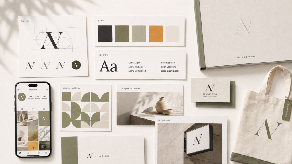
A brand is also built through colours, typefaces, photography, illustration, compositions and a consistent way of communicating.
The logo works as a signature, but it is the combination of all these elements that creates a recognisable personality.
A strong visual identity keeps the same language across every touchpoint: social media, website, stationery, packaging and advertising.
This does not mean every piece must look identical, but that they should feel like part of the same brand.
An effective identity must adapt to different formats and grow with the project.
That is why developing a brand is not only about creating something attractive. It is about building a visual system that can communicate, connect and be recognised.
A good logo can attract attention, but a good identity is what makes a brand memorable.
Featured article
A brand goes far beyond its logo. Discover how colours, typefaces and other visual elements work together to build a coherent, recognisable and memorable identity.
Latest articles
A visual identity does not begin or end with a logo. Learn which elements help build a coherent, recognisable graphic system that can grow with a brand.
Publishing constantly should not mean changing personality with every piece. A visual strategy for social media can be flexible while keeping a brand recognisable.
A good idea needs to become concrete visual decisions. This journey shows how to move from an initial concept to a system that works in real applications.
ArteVifusion
Tell me about your project.
Thanks for contacting us. This conversation has ended.
Reload the page to start a new conversation.