Blog · Branding
More than a logo: how to build a coherent visual identity
When visual identity comes up, the conversation often starts and ends with the logo. However, a recognisable brand needs much more than an attractive symbol. It needs a system capable of keeping the same personality across different formats, channels and moments.
The logo is only the starting point
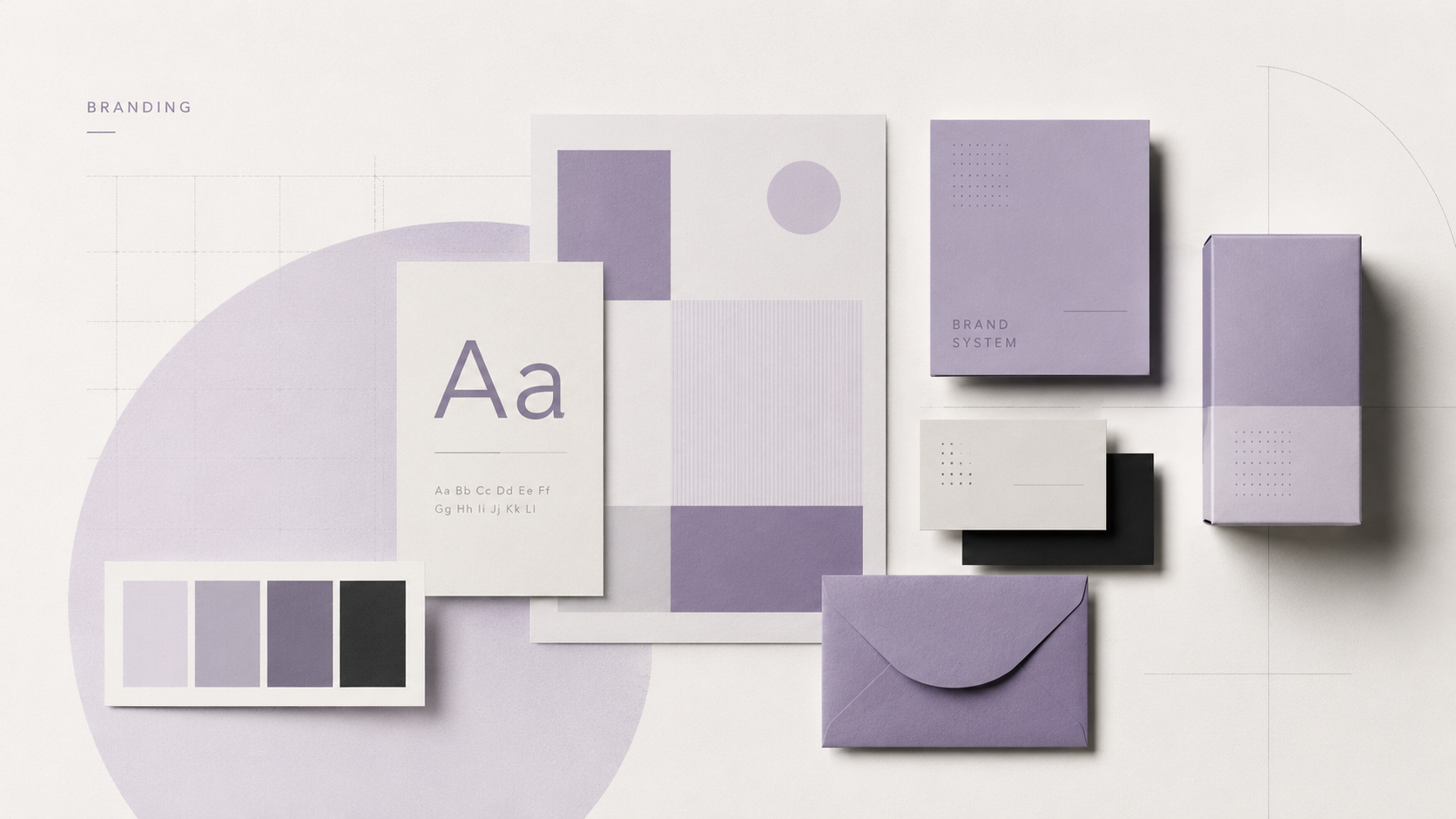
The logo works as a visual signature, but on its own it cannot solve every communication need. A strong identity is built through the relationship between type, colour, composition, images, illustration, graphic tone and application criteria.
When these elements work together, the brand can be recognised even when the logo is not present.
Consistency does not mean repeating the same thing
A good visual system should be consistent, but also flexible. The identity needs to adapt to a business card, social post, website, package or presentation without losing its personality.
The key is to define rules that are clear enough to support recognition while leaving room for the design to evolve.
Design with a system in mind
Before designing individual pieces, it helps to identify the brand’s main touchpoints. This reveals which elements it will really need and how they should relate to one another.
A colour palette should account for hierarchy and combinations. A typeface should work in headlines as well as small text. Graphic resources should be usable in different ways without losing consistency.
A visual identity works best when every piece feels part of the same conversation.
An identity ready to grow
Brands change, add products, reach new formats and find new audiences. That is why a visual identity should not be designed only to solve today’s needs.
Building a system lets communication grow without starting from zero every time. That continuity strengthens recognition and helps convey a clearer, more professional and consistent brand.
Conversation
An Engaging Blog Post
WOW,Very wonderful
Excelente página. Muy completa y con detalles.